Dissecting Irish Pub signs ACROSS THE GLOBE
and their rhetorical situation
DIVE IN
BACKGROUND: THE IRISH PUB CONCEPT
The design choices of Irish pubs outside of Ireland are mainly due to the Irish Pub Concept, a concept crafted by businessman Mel McNally in order to help muster a positive reputation for Ireland internationally. The IPC has a conscious goal to cater to a comforting Irish experience abroad, explaining why Irish pubs are designed so similarly across the globe.

RHETORICAL SITUATION
PURPOSE
To draw in business while establishing positive reputation for Ireland
GENRE
Signs of International Irish Pubs
AUDIENCE
Tourists, people of Irish descent, people looking to drink
MEDIUM
Wooden or metal
CONTEXT
Countries other than Ireland
COMMON FEATURES OF INTERNATIONAL IRISH PUB SIGNS
Between font, colour, and title, Irish pub signs tend to be very recognisable across the globe as they employ spatial, visual, and linguistic modes to draw in their audiences.
LEARN MORE BELOW

FONT
Shop front signs on Irish pubs across the globe share something in common: their font. Generally, a Celtic-inspired font presents the name of the pub, recognised by its geometrical composition and distinctive inspiration by the ancient Celtic writing system. In the example of Murphy’s Irish Pub in Puerto Vallarta, Mexico, the lettering is noticeably Celtic-inspired. The slight curves at the end of each letter stroke indicate a use of spatial delivery as they are sure to place lines of the letters in appropriate places to communicate an Irish inspiration.
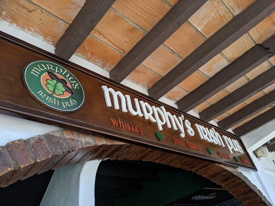
MURPHY’S IRISH PUB IN PUERTO VALLARTA, MEXICO

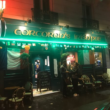
CORCORAN’S IRISH PUB IN PARIS,
FRANCE
COLOUR
Perhaps the most noticeable feature upon Irish pub signs across the globe is colour. The colour most associated with Ireland is green, and as such, many Irish pubs internationally are sure to paste green upon their signs. In the example of Corcoran’s Irish Pub in Paris, France, the background of the sign is green while gold is used for lettering. Most common colours used for Irish pub signs globally include green, gold, and blue. In incorporating the very important visual aspect of colour, international Irish pubs can easily draw in an audience searching for them.

TITLES
In addition to font and colour, titles of international Irish pubs usually fall into categories of Irish language, Irish surnames, or Irish phrases. In the example of Scéal Eile Irish Pub in Tokyo, Japan, the Irish language is used to directly communicate the establishment type, as is less obviously an Irish phrase. “Scéal Eile” translates to “Other Story,” a phrase often used in Ireland itself. By titling this pub in Irish, the pub demonstrates its legitimateness and clearly communicates that it is undoubtedly an Irish pub. The same is achieved with titles of Irish surnames and phrases, for such titles stand out in a non-Irish area.
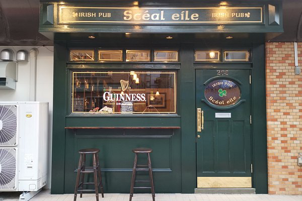
SCÉAL EILE IRISH PUB IN TOKYO, JAPAN

DESIGN ADVICE
In order to have a rhetorically successful Irish pub sign in a country other than Ireland, it is important to consider the strengths and weaknesses that signs feature. In Information Design, Romedi Passini defines “wayfinding” as how a visitor uses perception and behavior to interact with a public space and find their way around through sign posting, layout, perceiving routes, etc. In the case of Irish pubs, all design choices upon the sign are essential to how a visitor may find the establishment. Through consciously researching Irish pubs and their appearances upon signs, through modes like font, colour, and title, a designer can effectively draw attention and directly communicate to a visitor exactly what the establishment entails.
